Posts

Final Portfolio - Maeve Hydock
Image
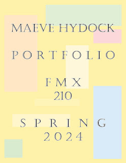
  Artist Statement: We have made it to my final portfolio. I can not believe how much I have learned throughout this course. I never imagined myself using any of these software's last year but here I am. I am so glad that I was able to take this course and work on all of these different projects. For my final portfolio I was able to combine everything I worked on using InDesign. I created 14 different pages and used the color wheel to create a color scheme for myself to use. I distributed these colors throughout the 14 pages. I then used two different fonts being, Barlow Condensed, and Castellar. I used Barlow Condensed as the font for my headings and main texts and Castellar for my normal texts. I used my own images for my table of context page, my about me page, and my final page. I am so grateful for everything I was able to learn throughout this course and I am excited to see what my future holds for me. 

Postcard - Maeve Hydock

Image
  Artist Statement: I decided to create a postcard for the city of Philadelphia located in Pennsylvania. For this project we were told to relate the business card off of a city/state that the solar eclipse was going to go through since we were working on this assignment during the time of the solar eclipse. I decided to chose Philadelphia because that is where I am originally from and where I grew up. The front of the post card has  a picture of the solar eclipse and a black and white detailed skyline of Philadelphia that i was able to place into InDesign. The back of the postcard has the title, “Philadelphia Eclipse” and then a small picture of a city skyline in front of a moon. To the right is where I placed my Tag Brush. 

Hydock - Business Card

Image
  Artist Statement:  I chose to go a different route with my business card as you can see by comparing the sketches that I drew to the three final front and backs of the business cards. I started by creating six horizontal images that were the same height and width. I then created three layers that were for the text, logo, and background, from here I imported my three different colored logos and put them on all six pages, two on each, I then moved them around to make each business card different. From here I added colors that went along with the three main colors of each logo. Finally I created a phone number, email, and @ to use for my business card and added these onto the back of each one.

Id HW 1 - Maeve Hydock

Image
 Video One: https://www.youtube.com/watch?v=0eqhUFRlvgI  To start creating the page looks pretty simple and we still use some basic steps that we have been using the whole year for InDesign which is also pretty simple. Then turning the paragraph styles on also looks pretty simple it is what we had to do to turn on the timeline for our animation. Therefore, to get everything set up to start working looks pretty easy. The pages part also looks easy which is what he was talking about in the video since it is one of the main things. However, the master page may be difficult for me since I may forget that it overrides everything.  Video Two: https://www.youtube.com/watch?v=yCAaLlrty1A  This video is similar to the first video. It is just a basic tutorial of InDesign. However, he did start off by using columns which was different from the first video. He started off with just the tools and then added pages. The columns do look a little difficult, however, I do think that when it comes time t

Animation - Maeve Hydock

Image
  Artist Statement:  In my animation "Blossoms and Sunshine," I wanted to show the cool journey of a flower blooming, all made in Photoshop. Starting with the timeline, I brought together a bunch of images to tell the story of a flower growing. I embedded each individual image into photoshop. I used the quick selection tool to cut out each piece just right, and with the brush tool, I switched up from white to black to make that growing effect of the flower. Every image got its own layer, and I grouped some together to stay organized by making a folder. Masking was key for making everything blend smoothly. My goal was to make something that feels real and full of life, like you're watching a real flower bloom right in front of you. It's a simple, chill animation that I hope makes people feel as happy as a sunny day with flowers everywhere.

Anime HW 1 - Maeve Hydock

Image
 Video 1: https://www.youtube.com/watch?v=Llr_KTNtdlk  Overall it seems like a long bus, not a super difficult process. At the beginning of the video, he was using the brush tool to create an actual drawing of what he was then going to animate. He used different layers to complete the drawing. I do this this would be a bit difficult since I have never done this before. It would definitely be easier to use images from the internet like gifs to start instead of drawing something on my own. As I said in the beginning the actual animation process does not look that difficult it just looks a little time-consuming.  Video 2: https://www.youtube.com/watch?v=IO1yDUJl8qw  This video revolved mainly on the timeline process and how to use that. Overall this does seem a little difficult but I think it is something that will end up becoming easy once I get the hang of it. Doing different video groups and layers seems challenging because you have to make sure that you are choosing the correct groups

Somewhere - Maeve Hydock

Image
Artist Statement: For this piece, I decided to base it on one of my favorite shows, The Mick. The Mick was a short TV comedy series about an Aunt who took care of wealthy children. I would watch this show whenever I was upset to cheer me up which is why I chose this show because it means something to me. I decided to use a clip from the show featuring Chip and Sabrina, who are two of the main characters in the show. In this image, they are waving up to their Aunt during their little brother, Ben, party. I decided to photoshop myself behind Sabrina. I decided to take a picture of myself looking up and waving as well so it looked like I was including in what Chip and Sabrina were doing. To create this piece I used the quick selection tool along with the clone stamp tool. I then made multiple different layers to adjust the ton of my body closer to everyone else's in the picture.