LOGO - Maeve Hydock
Artistic statement:
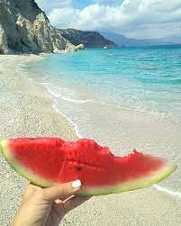
I decided to combine a watermelon and sand dollar into one to create a logo that represents me. I wanted to create a piece that had something to do with the beach since I have been going to the beach every summer since I was born. However, this was a little broad which is why I decided to do the watermelon which is my favorite summer fruit. I then chose the sand dollar to represent the beach since I always collected sand dollars when I was younger. I created my Black and White logo by using the pen tool, ellipse tool, and pencil tool. I used the pencil tool to make/create the shapes inside the sand dollar and used the pencil tool to also help with those lines inside the sand dollar. I then used the ellipse tool to create the shape of the water melon and sand dollar and then got the rigid shape of the sand dollar by using the pen tool. I had three different layers, The first layer was an image of my sketch, the second layer was the outline of the sand dollar and fill of the watermelon, and the third layer was the design inside the sand dollar and the seeds in the watermelon. I created my three different colored versions by inserting my black and white version and changing the fill and stroke. My first colored version consisted of the original real life colors of a sand dollar and watermelon, my second and third consisted of more fun colors. My inspirational image brings us back to what I mentioned in the beginning. I enjoyed collecting sand dollars at the beach and watermelon is a summer fruit that just so happened to be my favorite fruit to eat at the beach.


Comments
Post a Comment